

Imagine managing multiple phone numbers effortlessly on a single smartphone. For small businesses and busy professionals, this convenience can transform daily communication. Verizon My Numbers offered just that, allowing users to add up to four additional lines with unlimited domestic calling and texting. Here’s how we made it happen.
As the sole UX/UI designer, I led the project from concept to launch, and through multiple upgrades. I crafted the vision for both Android and iOS platforms, collaborating closely with product managers, engineers, researchers, content strategists, and QA. Our team worked in agile sprints to build the product. We had weekly sync-up meetings to ensure alignment between designers, developers, and product managers.
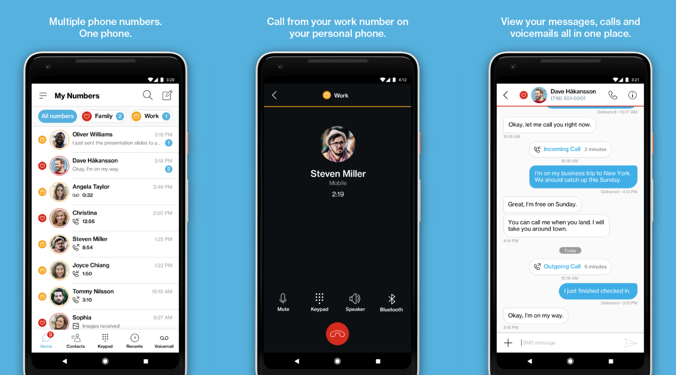
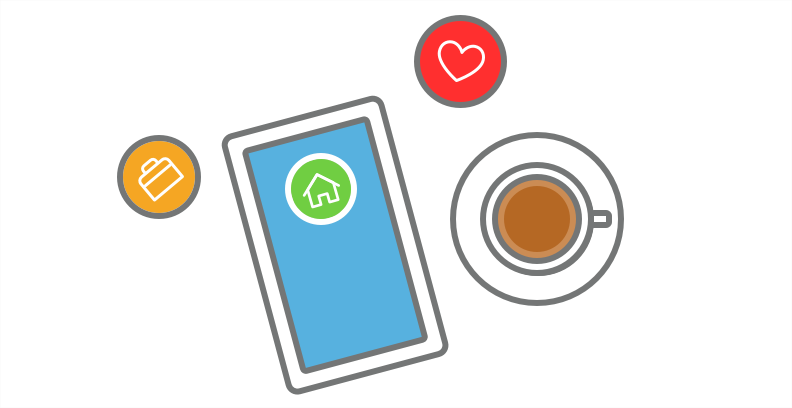
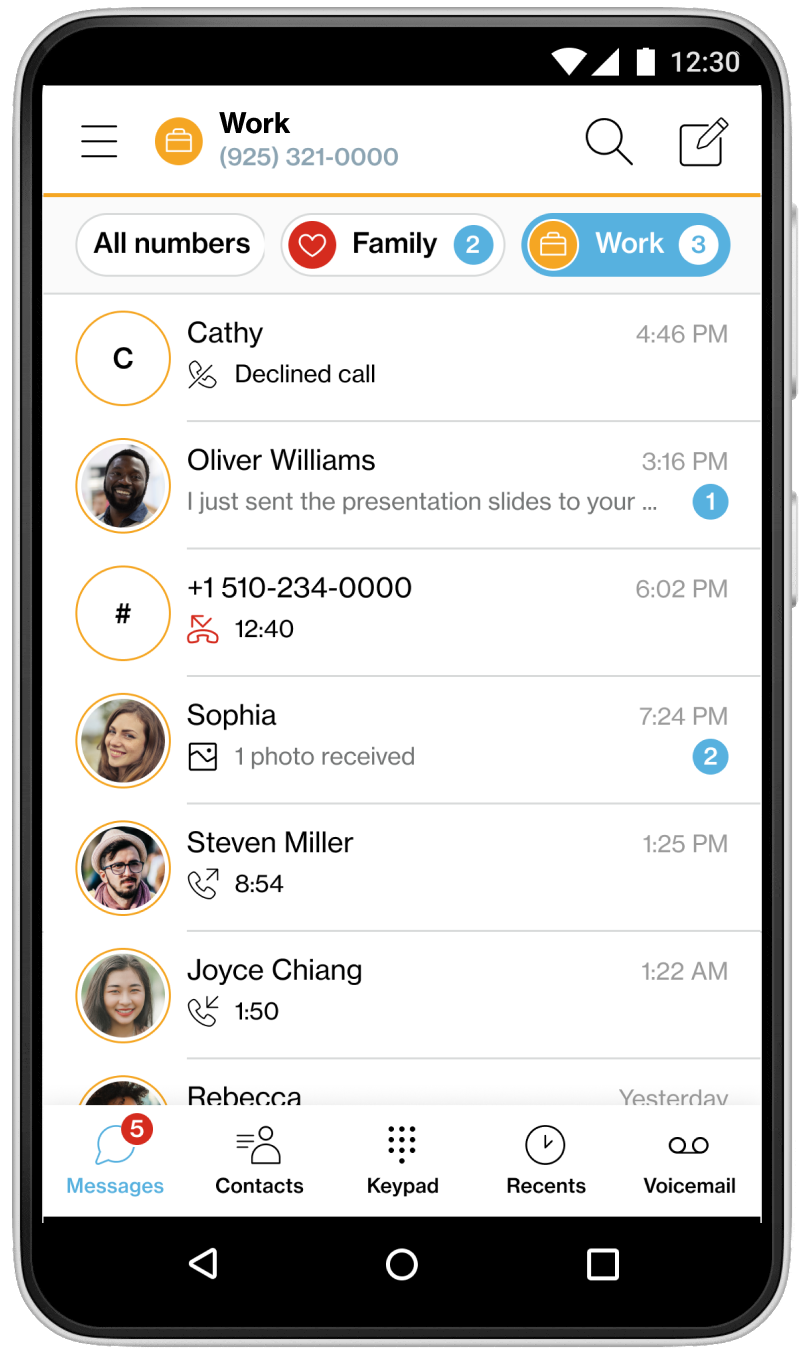
The vision of designing the Verizon My Numbers is allowing Verizon Wireless users to have multi-line phone numbers on a single device. So, users can streamline their lifestyle and carry fewer devices.

Professionals
People who needed to separate business and personal calls on one device.
Salespeople
Individuals who used multiple phones for different sales channels or client segments.

Privacy-conscious users
People who wanted a separate number for online accounts or services they didn't fully trust.
114.2 million wireless retail connections (2016 Verzion annual report), more than 20% of Verizon customers carry multiple devices to stay connected with their business and personal contacts.
Virtual number (VoIP) Pros
Virtual number (VoIP) Cons
Our goal was to provide a service for Verizon Wireless customers that offered the option to add up to four virtual numbers to a single device. These virtual numbers could also be synced across multiple devices, allowing users to share the same number based on their needs.
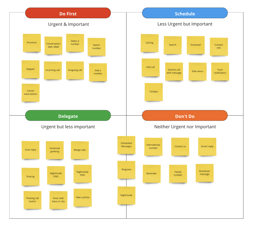
In the beginning, we prioritized the features we wanted to focus on first. The project manager, designers, and development teams worked together to define the scope.
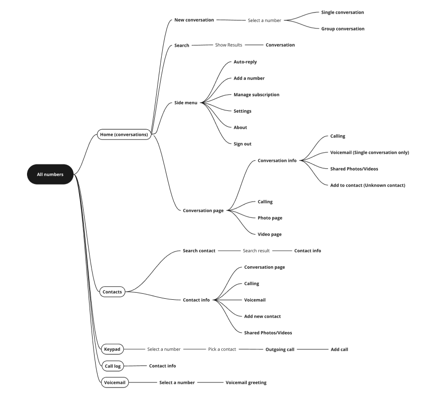
Information architecture helped us to understand the overall application structure before delving into the design phase. For more complex individual use cases, we then defined user flows to map out the user's journey.
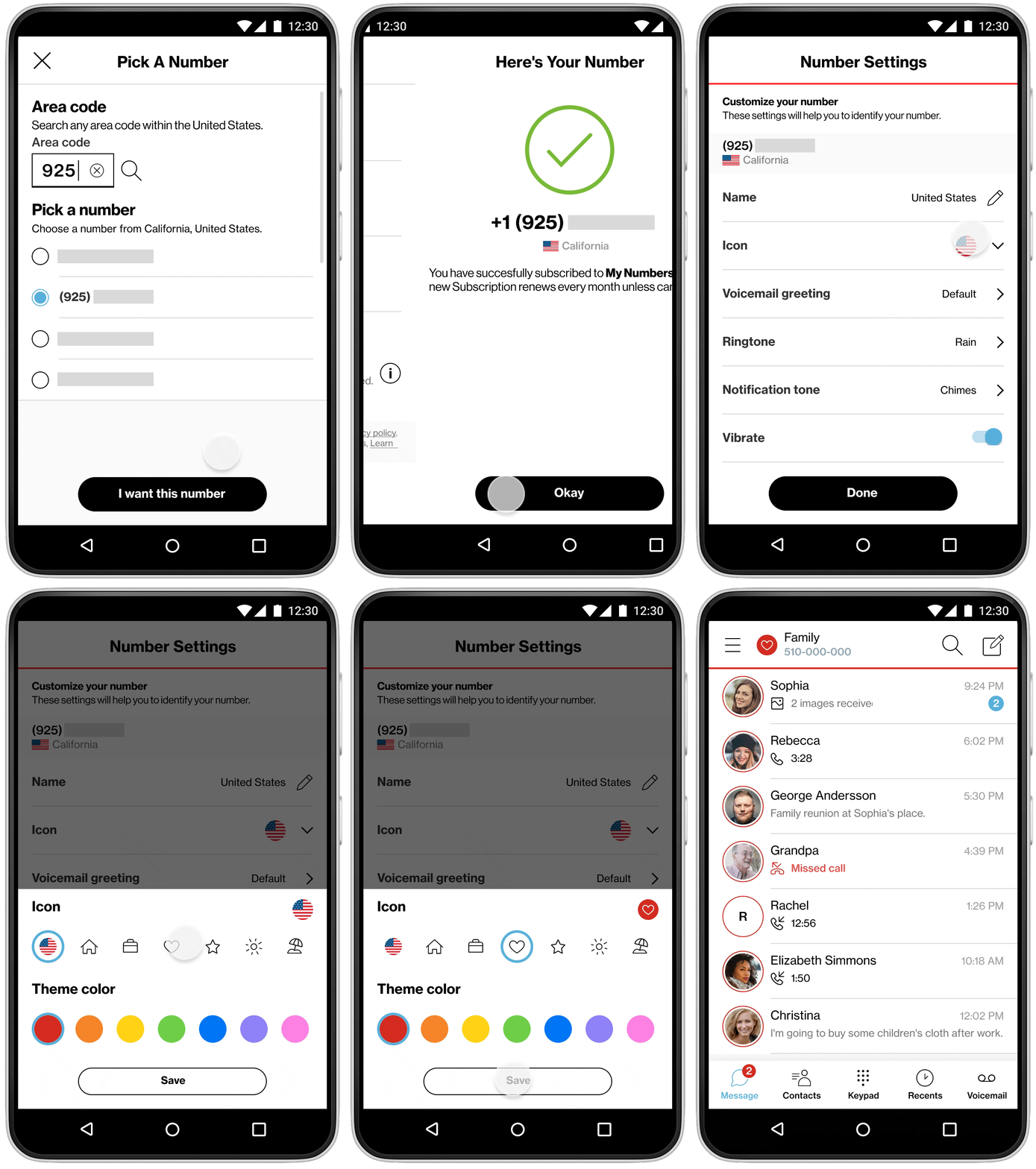
The user onboarding process for obtaining a virtual number was first sketched out in mockups to get a sense of each step. During this process, we collaborated to define the different provisioning use cases.
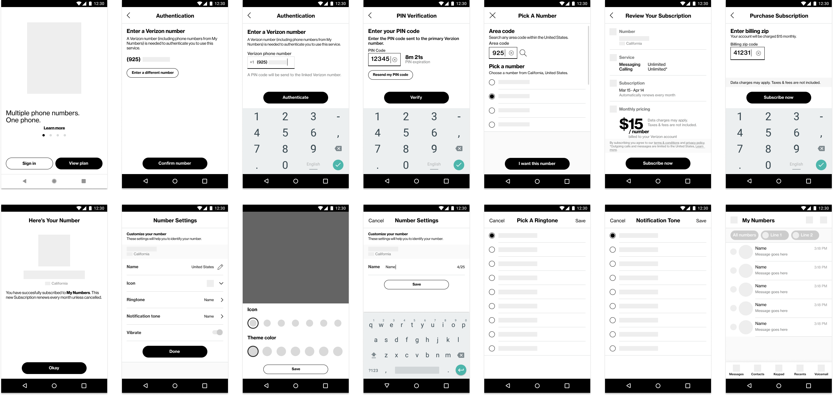
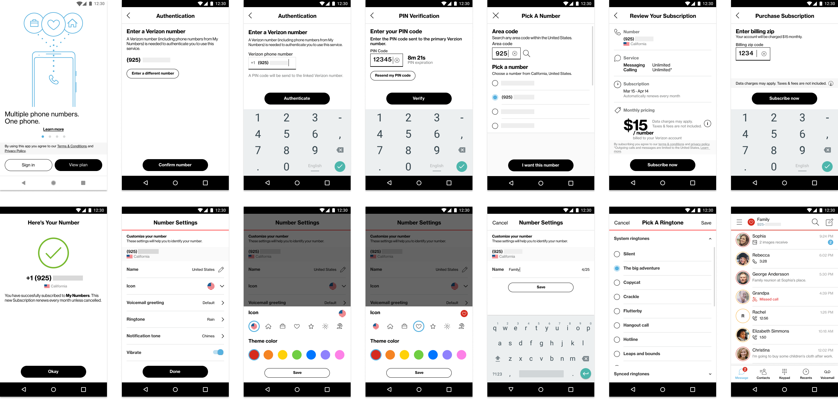
Users can label, color-code, and assign icons to each line in the number settings.
A prototype was built to test the onboarding and number switching experience with a group of users. This allowed us to gather valuable feedback on usability and functionality. Users appreciated the ability to customize their own number and understand the number settings function.
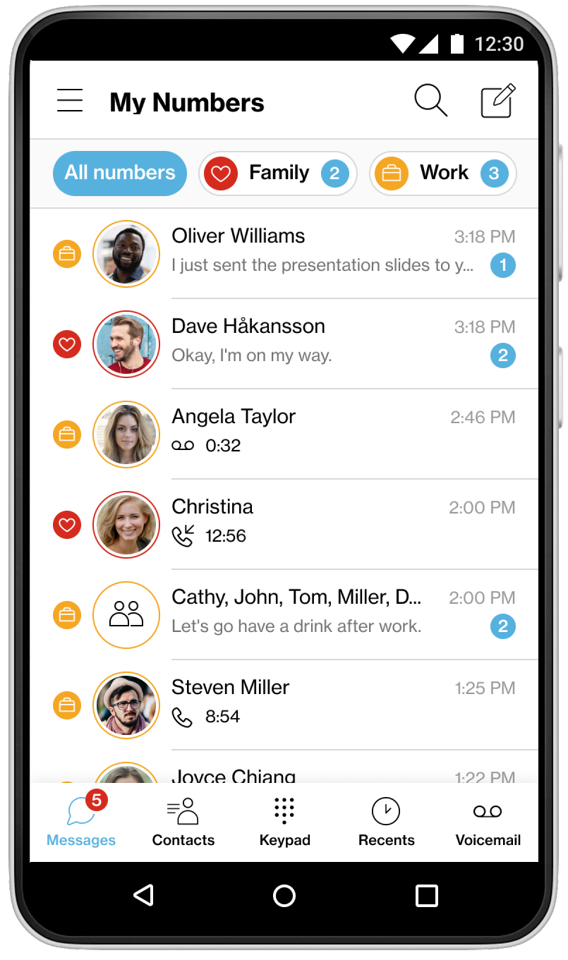
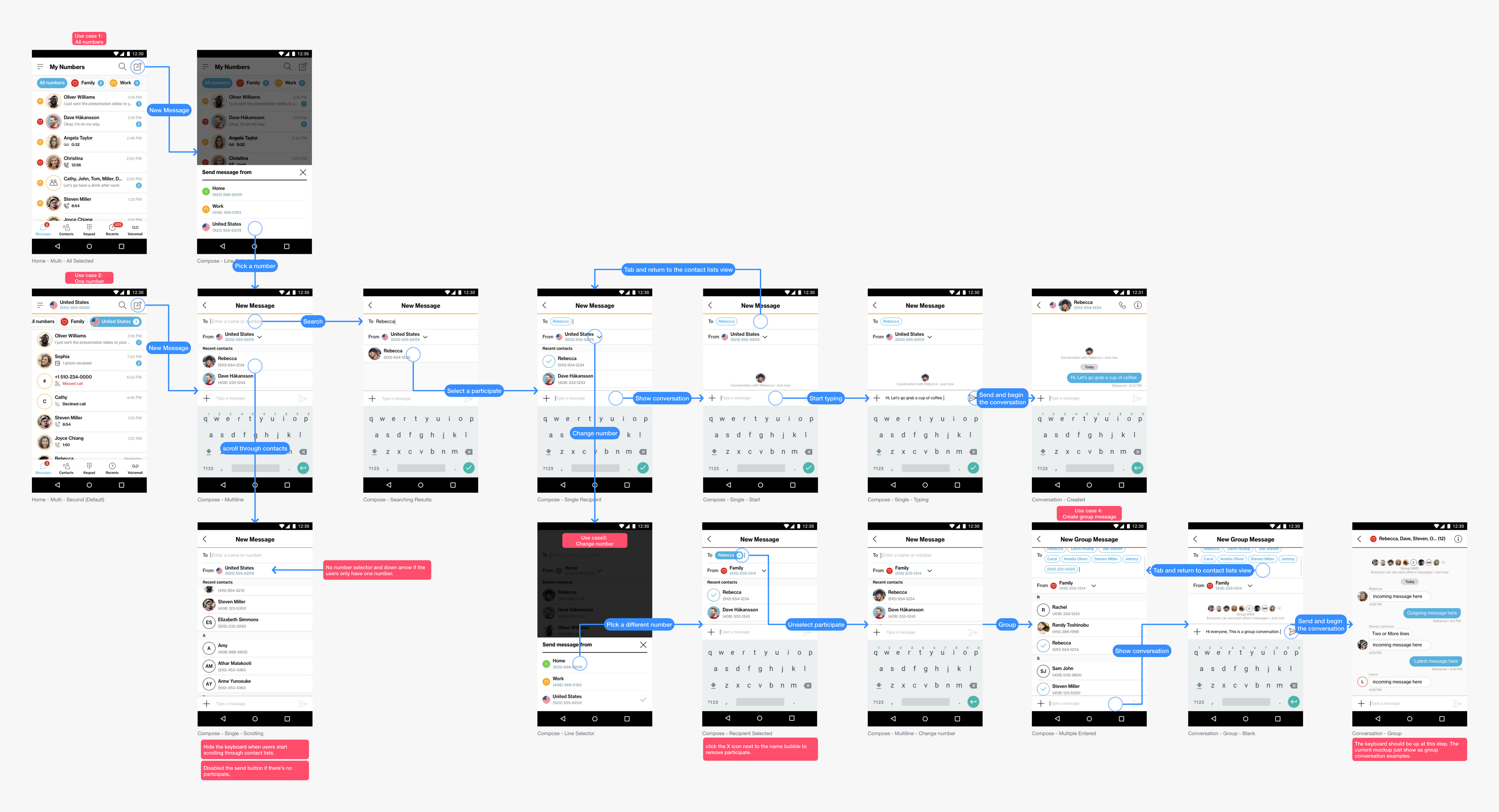
For creating message, I have to defined distinct user cases for switching between individual and group conversations, as well as user behavior for selecting a number and identifying the virtual line from which messages are sent.
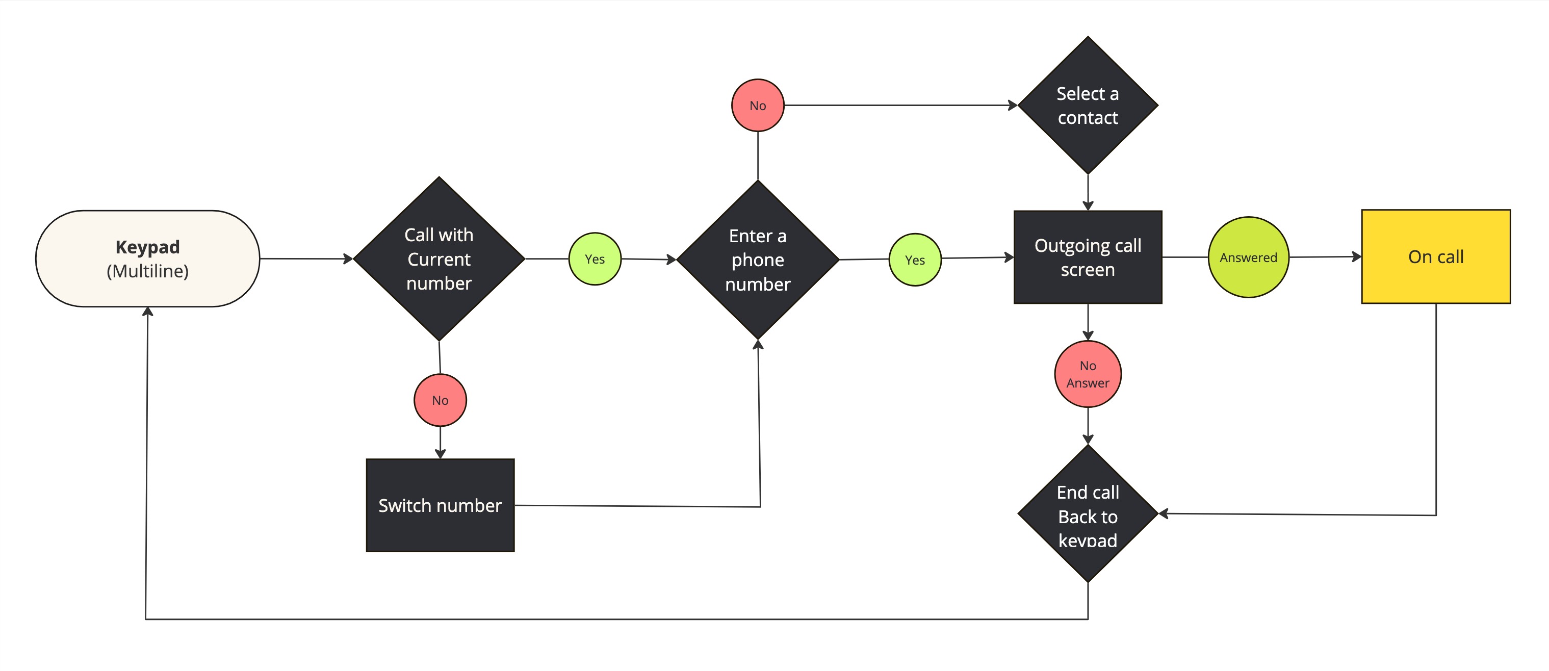
I collaborate with developers to define calling user flows and address technical challenges before initiating the design process.
Challenages
One of the biggest challenges we faced was call quality and stability. Our team and stakeholders dedicated significant time to testing the calling experience. I collaborated with five other QA testers to ensure all user interactions and function were designed as intended.
A limitation of the iOS callKit meant that users would initially see the native calling screen for incoming calls, unlike the fully customized UI available on Android. After users answered the call on iOS, users could transition back to the app for a more controlled environment.
To resolve the iOS callKit limitation, I ensured the caller and the label of the virtual number are displayed on screen. Since call quality relies on internet service, I added notifications to alert users of poor network connections before and during the call, so they could move to a better location if necessary.
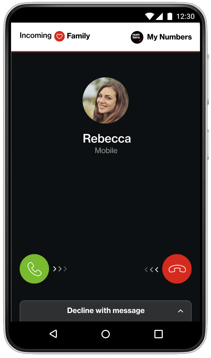
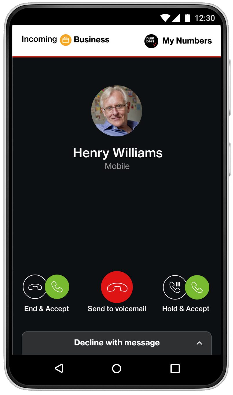
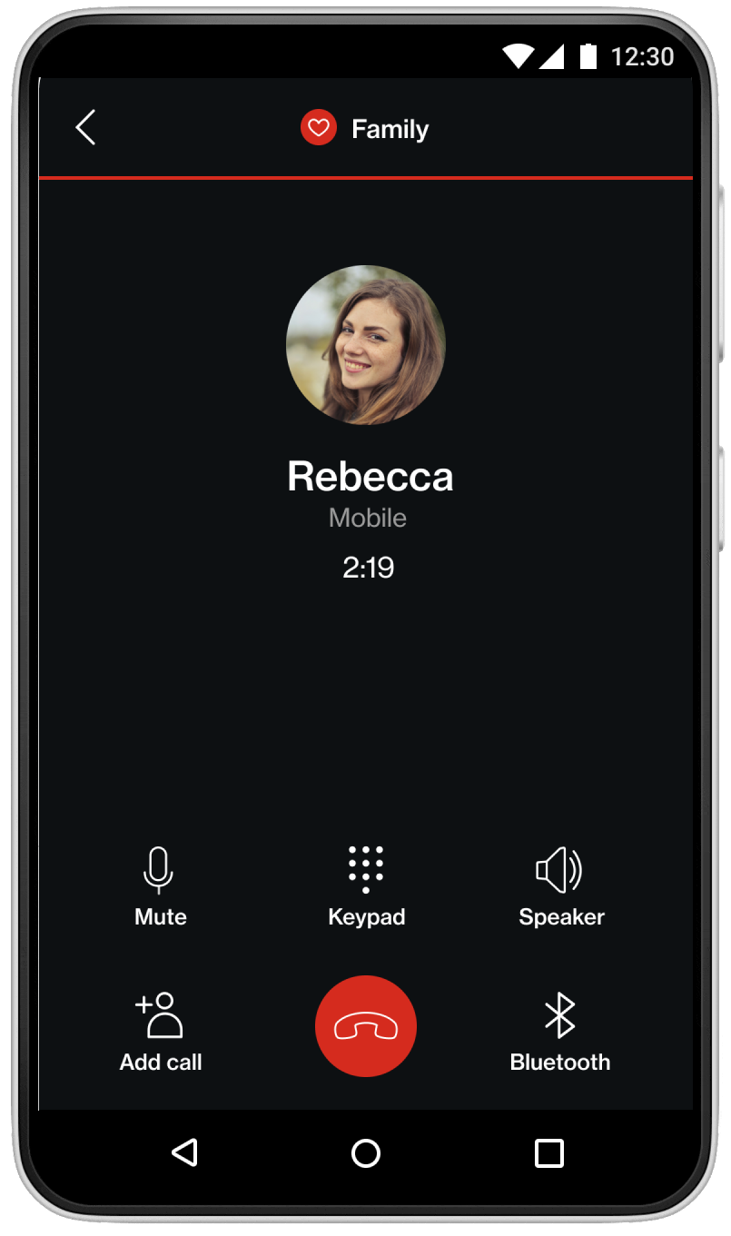
To ensure a consistent user experience across platforms, I developed a unified design system. This system documented fonts, colors, iconography, and spacing in a comprehensive style guide. Additionally, I leveraged Zeplin, a collaboration platform, to bridge the gap between design and development.
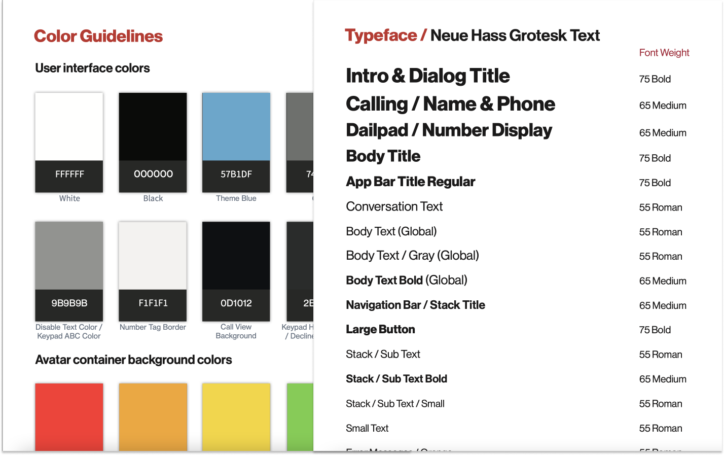
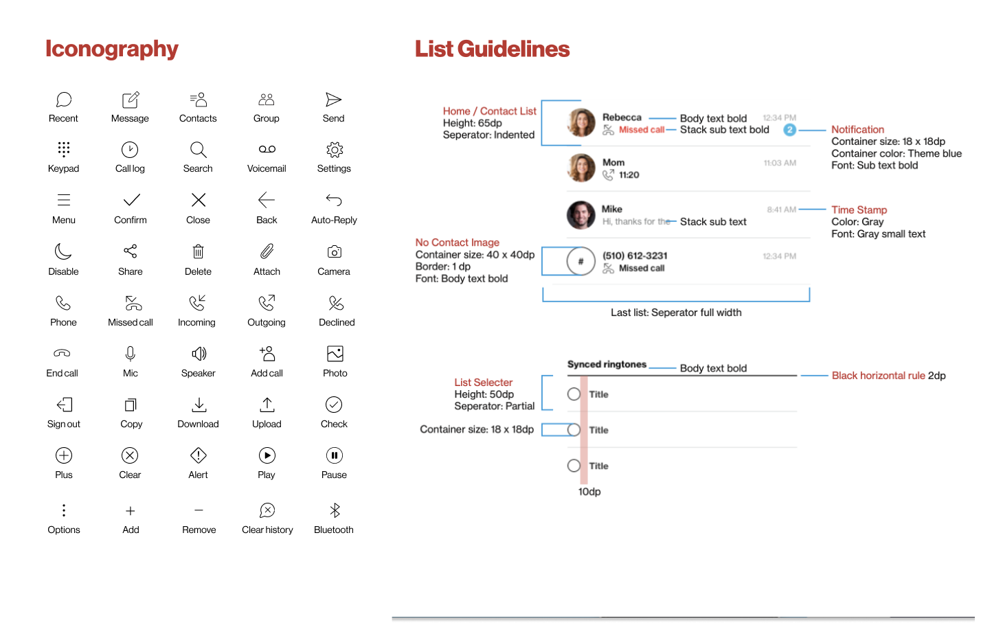
The streamlined user interface and onboarding process received positive feedback for ease of use and clarity. Users appreciated the ability to label, color-code, and assign icons to each line, enhancing their control over communication. The unified design system ensured a consistent and intuitive experience across both Android and iOS platforms. Verizon My Numbers was launched on November 15, 2018, with integration of virtual numbers with the network infrastructure. The service simplified communication for users by reducing the need for multiple devices and allowing customization of phone numbers. We successfully addressed call quality and stability challenges, ensuring a smooth user experience.
I gained valuable experience in delivering a great product. Agile sprints ensured that our design, development, and product teams remained synchronized.