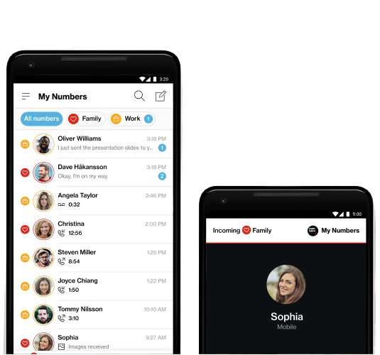
Imagine managing multiple phone numbers effortlessly on a single smartphone. For small businesses and busy professionals, this convenience can transform daily communication. Verizon My Numbers offered just that, allowing users to add up to four additional lines with unlimited domestic calling and texting. Here’s how we made it happen.
As the sole UX/UI designer, I led the project from concept to launch, and through multiple upgrades. I crafted the vision for both Android and iOS platforms, collaborating closely with product managers, engineers, researchers, content strategists, and QA. Our team worked in agile sprints with weekly sync-up meetings to ensure alignment.
Problems
Device Overload: Customers needed to streamline their lifestyle and reduce the number of devices they carried.
Separation of Communications: They wanted to keep personal and business communications separate without hassle.
Cost Efficiency: Managing multiple phone plans was costly and inconvenient.
Objective
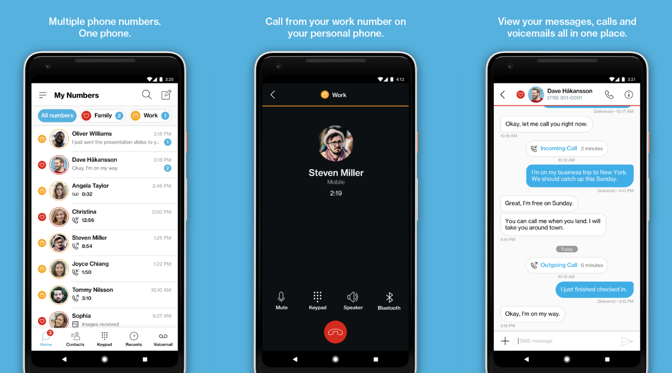
✅ Multi-line Capability: Enable Verizon customers to manage more than one number on the same device.
✅ Seamless Communication: Remove the hassle of managing multiple devices for texting and calling.
✅ Customization: Allow users to customize their numbers to differentiate between personal and business lines.
Target Audience

Professionals
People who needed to separate business and personal calls on one device.

Salespeople
Individuals who used multiple phones for different sales channels or client segments.

Privacy-conscious Users
People who wanted a separate number for online accounts or services they didn’t fully trust.
Research
114.2 million wireless retail connections (2016 Verizon annual report) showed that more than 20% of Verizon customers carry multiple devices to stay connected with their business and personal contacts. Competitor analysis included Google Voice (2009) and T-Mobile Digits (2017), offering free virtual numbers (T-Mobile at $10/month for an additional line). Our goal was to allow up to four virtual numbers, synced across devices.
Virtual Number (VoIP) Pros:
Cost-effective, flexible across devices, advanced features like call forwarding.
Virtual Number (VoIP) Cons:
Internet-dependent, variable call quality, security vulnerabilities.
Process
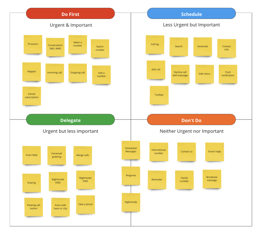
Prioritization:
We prioritized features with PMs, designers, and developers to define the scope.
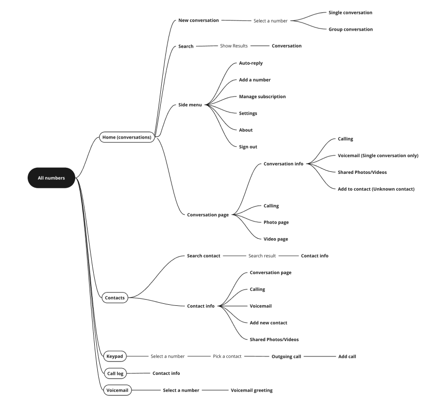
Information Architecture:
Mapped the app structure and user flows for complex use cases.
Onboarding & Number Switching
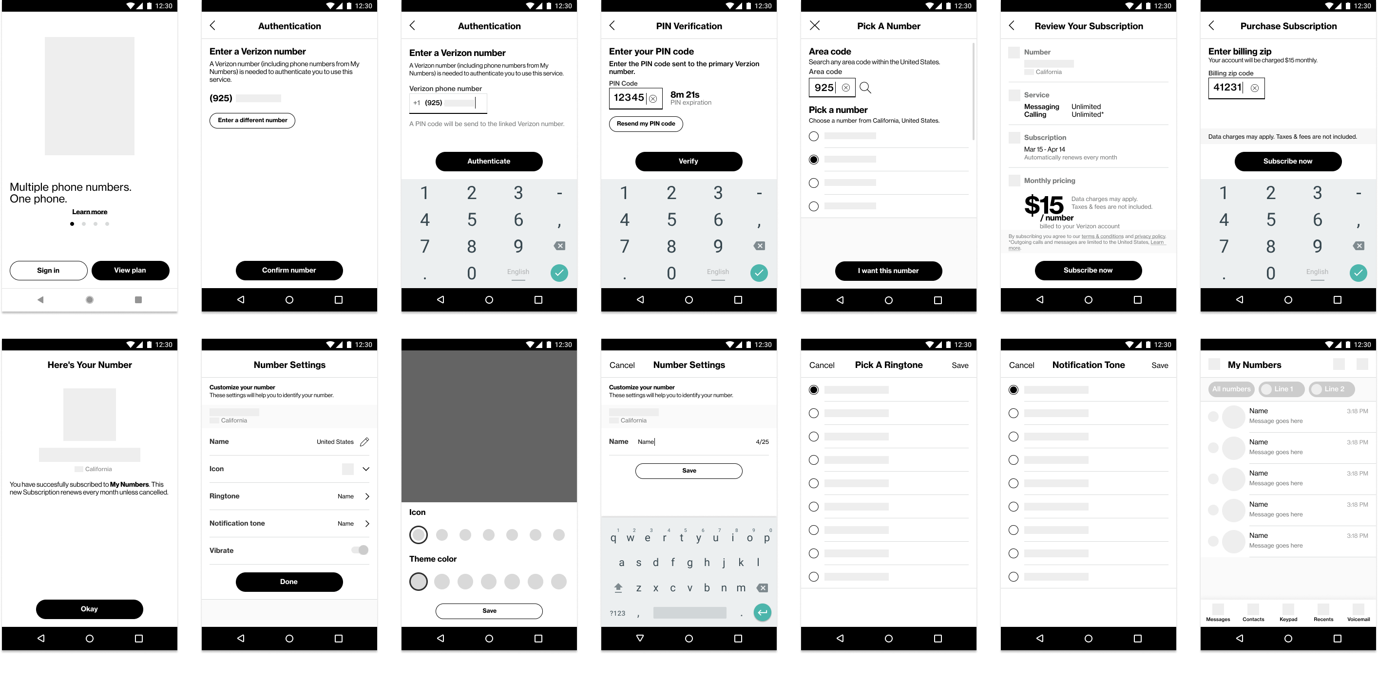
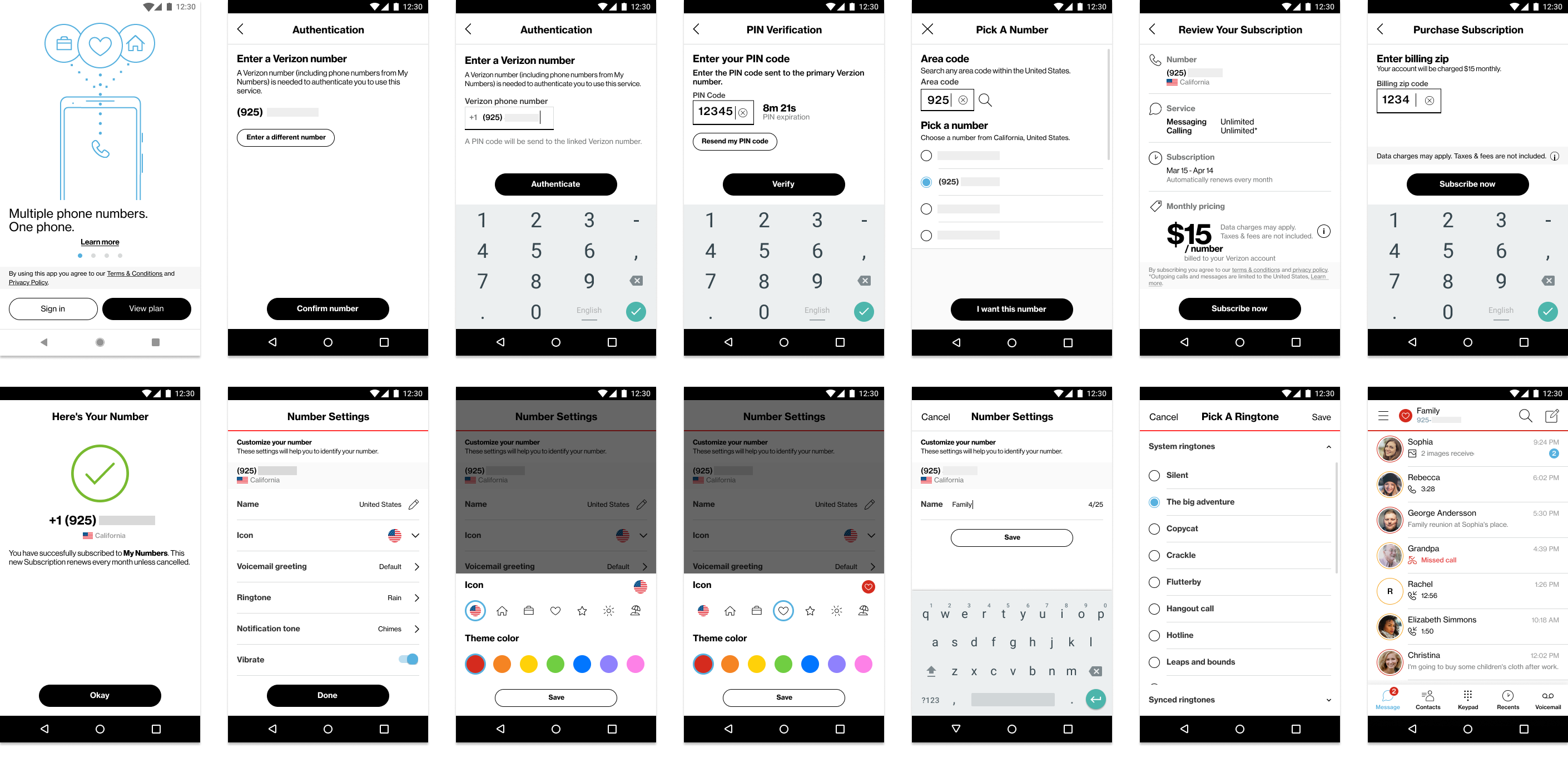
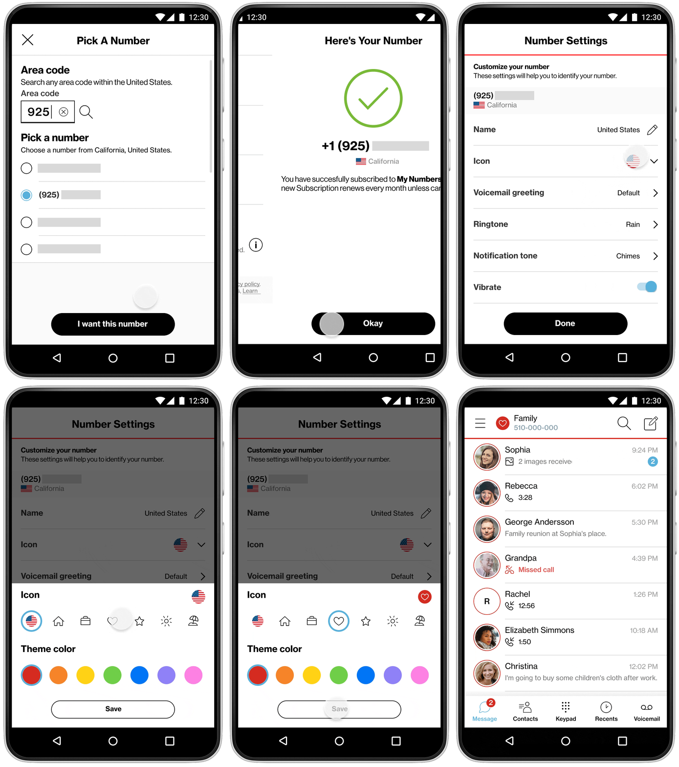
The onboarding process for adding virtual numbers was mocked up to define provisioning steps. A prototype tested onboarding and number-switching usability, with users appreciating customization options (labels, colors, icons).
Prototype & User Testing
Key Takeaways:
Participants completed tasks, asked about area codes, and suggested voicemail greetings.
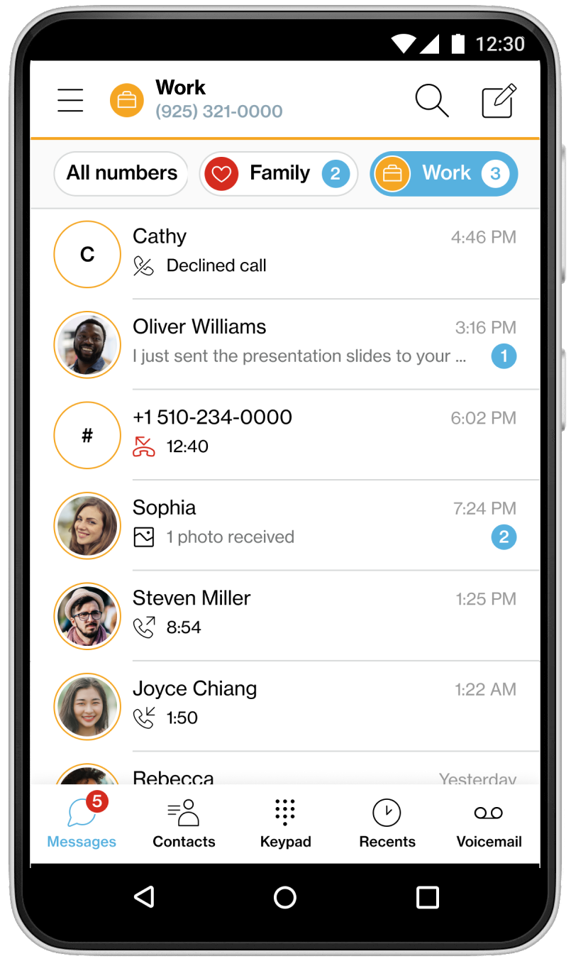
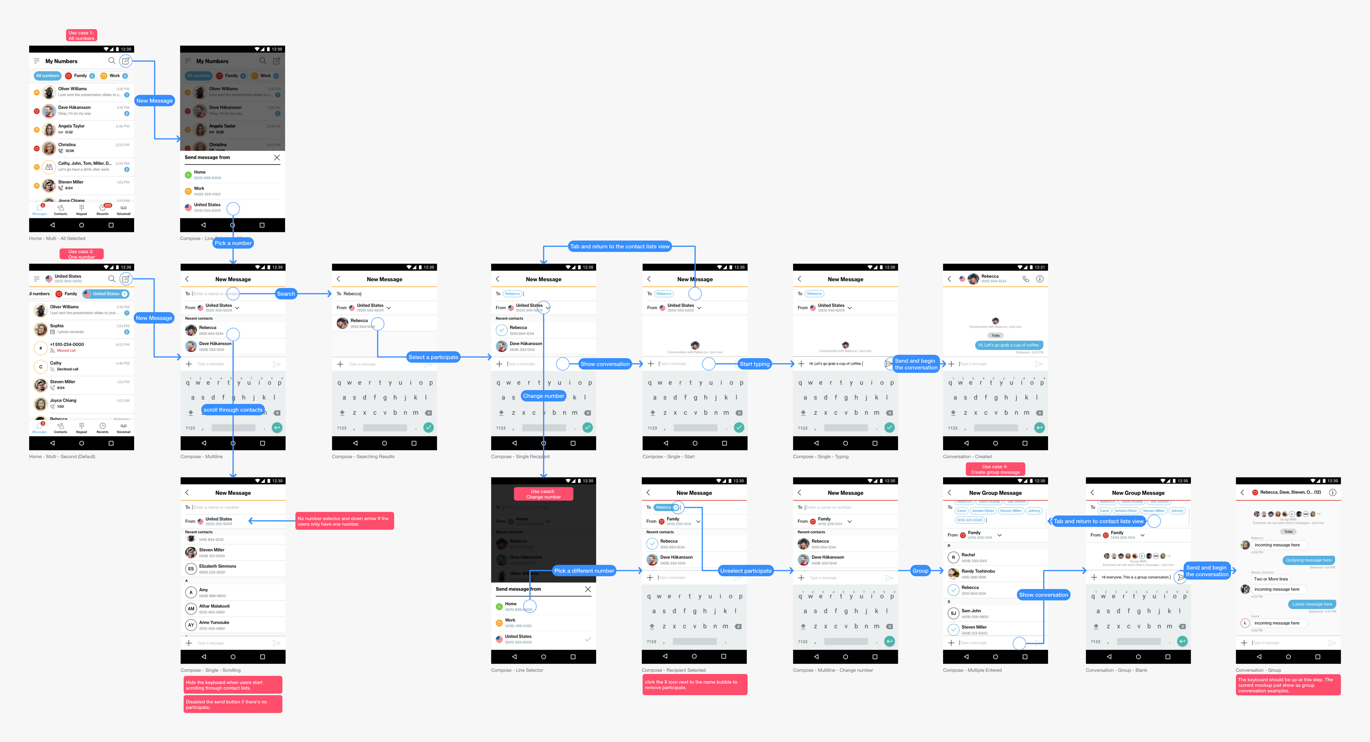
Conversations & Calling
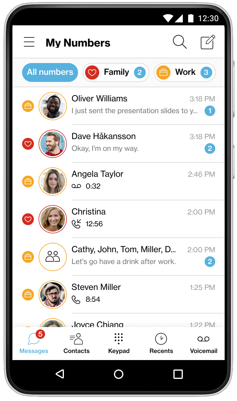
Defined user flows for messaging (individual/group) and outgoing calls, addressing number selection and call quality challenges. iOS CallKit limitations were mitigated with in-app transitions and network alerts.
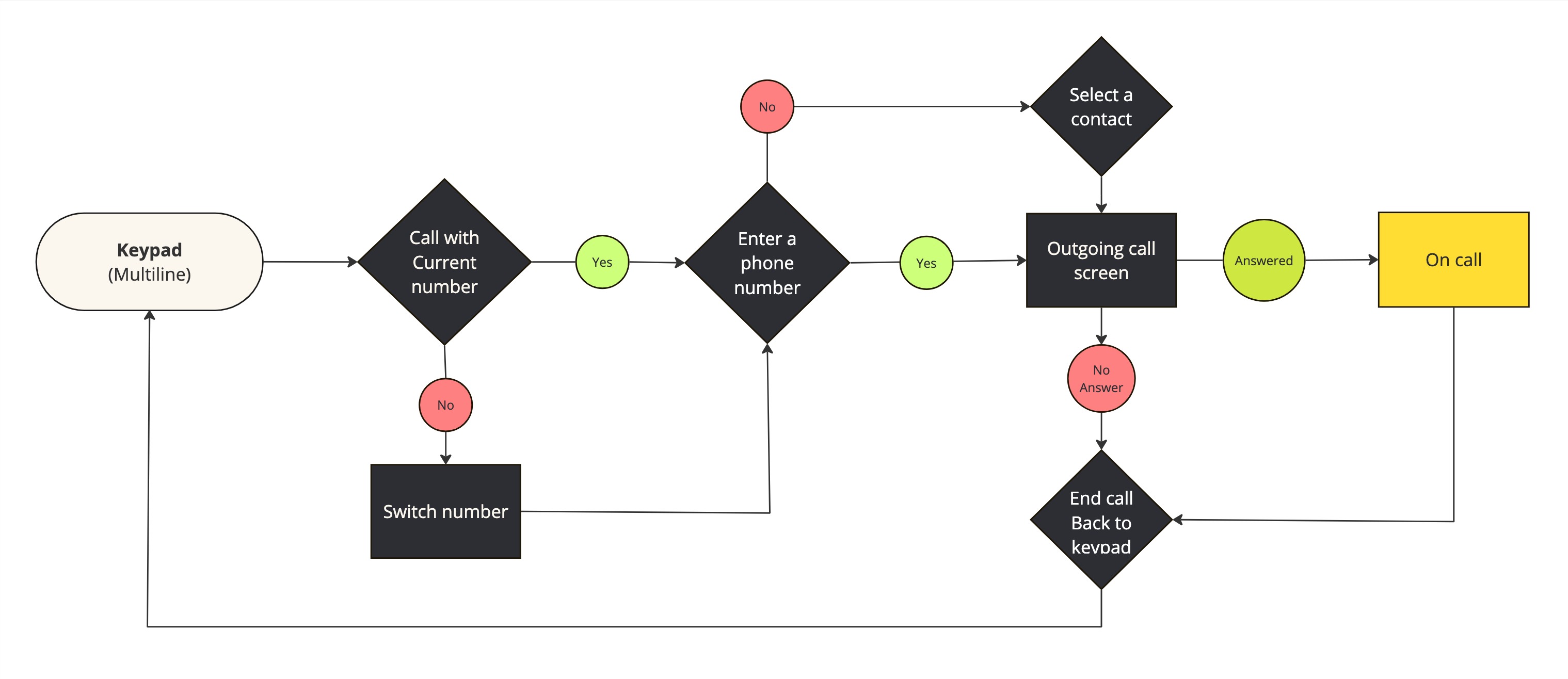
User Flow (outgoing call example)
I collaborated with developers to define calling user flows and address technical challenges before initiating the design process.
Calling Challenges:
One of the biggest challenges we faced was call quality and stability. Our team and stakeholders dedicated significant time to testing the calling experience. I collaborated with five other QA testers to ensure all user interactions and functions were designed as intended.
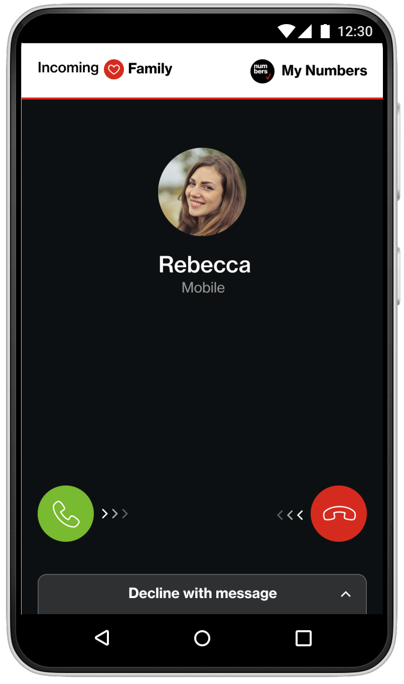
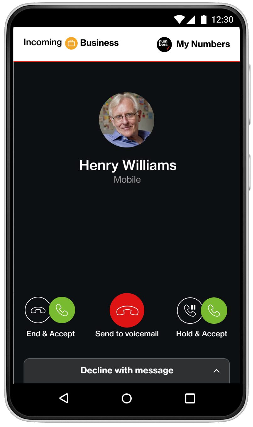
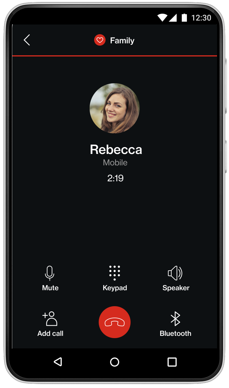
A limitation of the iOS CallKit meant that users would initially see the native calling screen for incoming calls, unlike the fully customized UI available on Android. After users answered the call on iOS, they could transition back to the app for a more controlled environment.
To resolve the iOS CallKit limitation, I ensured the caller and the label of the virtual number are displayed on screen. Since call quality relies on internet service, I added notifications to alert users of poor network connections before and during the call, so they could move to a better location if necessary.
Design System
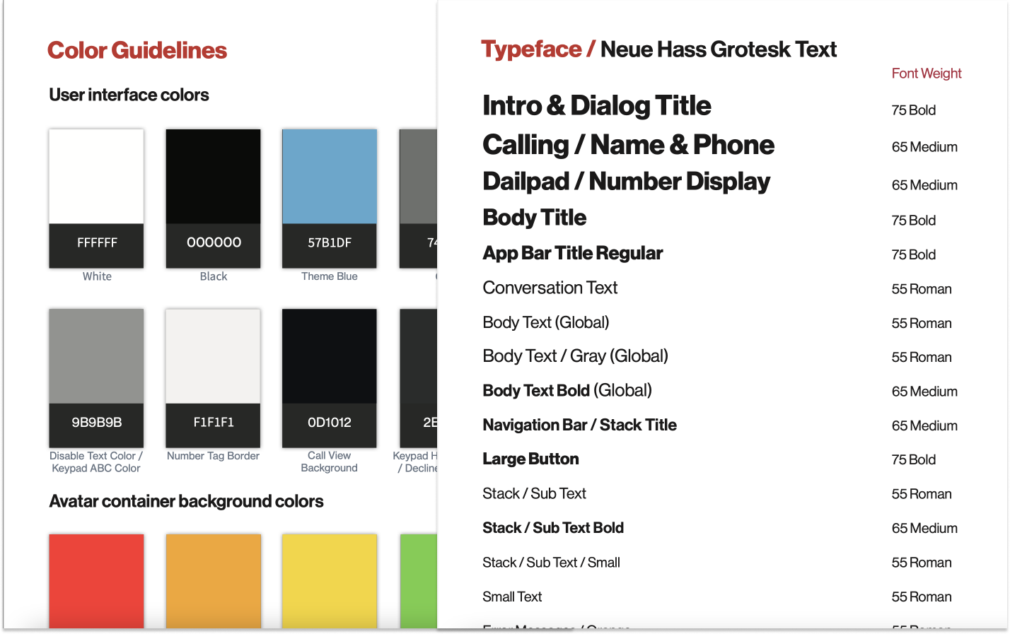
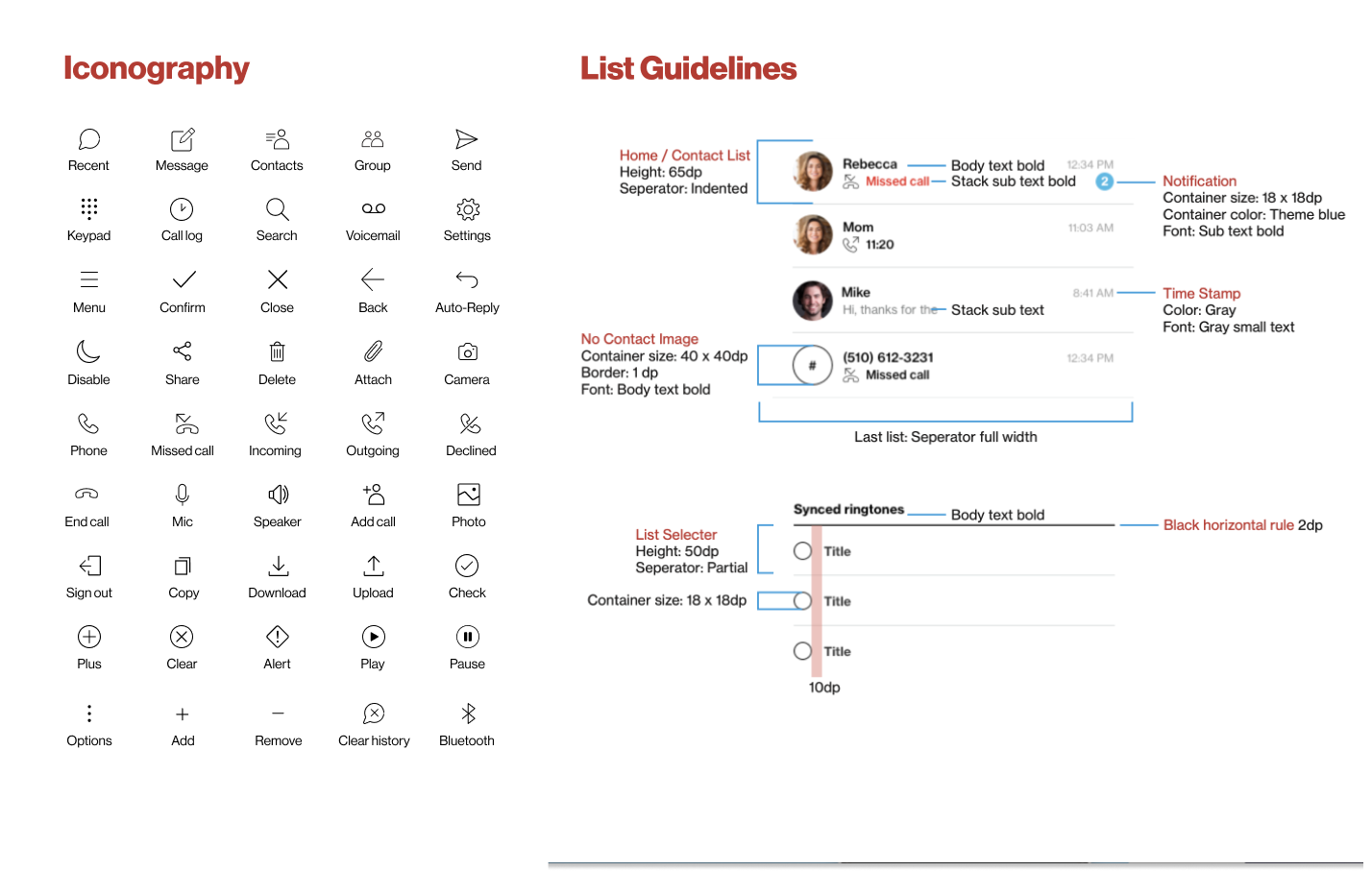
A unified design system with fonts, colors, icons, and spacing was documented in a style guide, shared via Zeplin for seamless design-to-development collaboration.
The Outcome
Launched on November 15, 2018, Verizon My Numbers simplified communication by offering a streamlined UI and intuitive onboarding process. Users appreciated the customization options and cross-platform consistency, which allowed for a seamless experience across Android and iOS.
Key outcomes:
- Improved user satisfaction with easy line-switching and number management.
- Overcame call stability challenges with constant testing and collaboration with the development team.
- Delivered a successful product on time, thanks to agile sprints and regular stakeholder communication.
