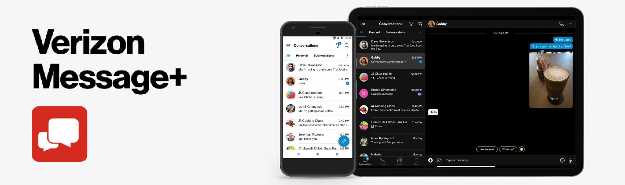
Verizon Messages (Message+) is a cross-platform text messaging application that synchronizes all conversations across multiple devices, including SMS text messages, MMS group messages, and OTT group messages, allowing up to 250 participants in a single conversation. This app also lets you personalize conversations with a variety of backgrounds, bubble styles, fonts, and more.
I led the UX/UI design and mentored another designer, guiding the rebrand and add-on features from initial concept to beta and through various upgrades and feature enhancements in the official integration. I set and executed the vision for the product experience on Android, iOS, and desktop platforms, collaborating closely with product managers, engineers, researchers, content strategists, and QA.
Problems
Users receive an overwhelming volume of messages daily.
Important messages get buried under promotional content and transactional updates.
Lack of efficient message organization leads to missed communications and reduced productivity.
Frustration and inefficiency in locating specific messages in a cluttered inbox.
Objective
✅ Streamline messaging experience by automatically sorting incoming messages into relevant categories.
✅ Enhance user productivity by making important messages easily accessible.
✅ Reduce inbox clutter and improve overall message management.
✅ Provide a personalized and efficient communication experience.
Target Audience
General Users
Everyday users who wish to declutter their inbox and easily find important messages.
Professionals
Individuals who need to manage and organize their business and personal communications to stay productive.
Power Users
Users seeking advanced features to customize their messaging experience.
Research
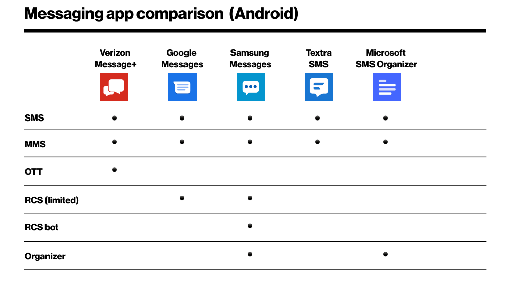
I conducted competitor research to evaluate apps with similar features and RCS (Rich Communication Services) messaging support. A detailed investigation into RCS-specific functionality played a key role in shaping the second phase of the feature enhancement strategy.
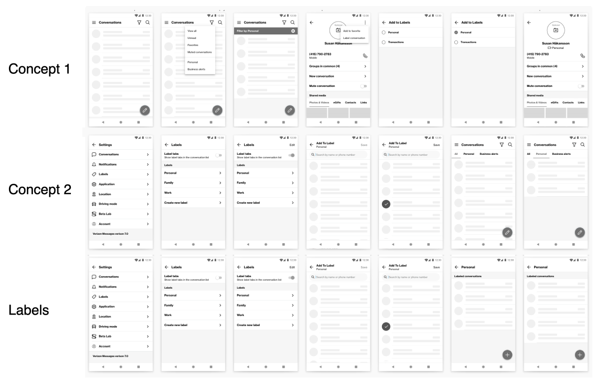
Ideate & Prototype
During the ideation stage, I collaborated with the PM and another designer to define user needs using the HMW (How Might We) method. We brainstormed solutions and created low-fidelity mockups to visualize ideas. A remote usability study with 7 participants tested the prototype, focusing on usability and usefulness of the message organizer feature.
Key Takeaways:
1. Labels were easy to understand and use.
2. Confusion around company labels and contact labeling.
3. Suggestions for more visible label management.
4. High perceived utility of the feature.
Solutions
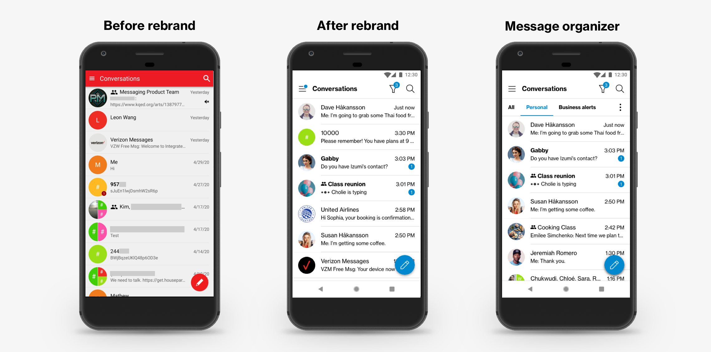
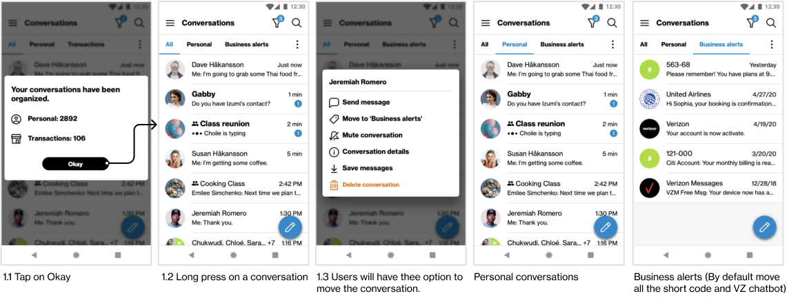
Initial Concept: Multiple tabs for "Personal" and "Business" alerts as the MVP.
Business Alerts: Messages from short codes and Verizon chatbot auto-categorized.
Custom Labels (Post-MVP): Allow users to create and manage their own labels.
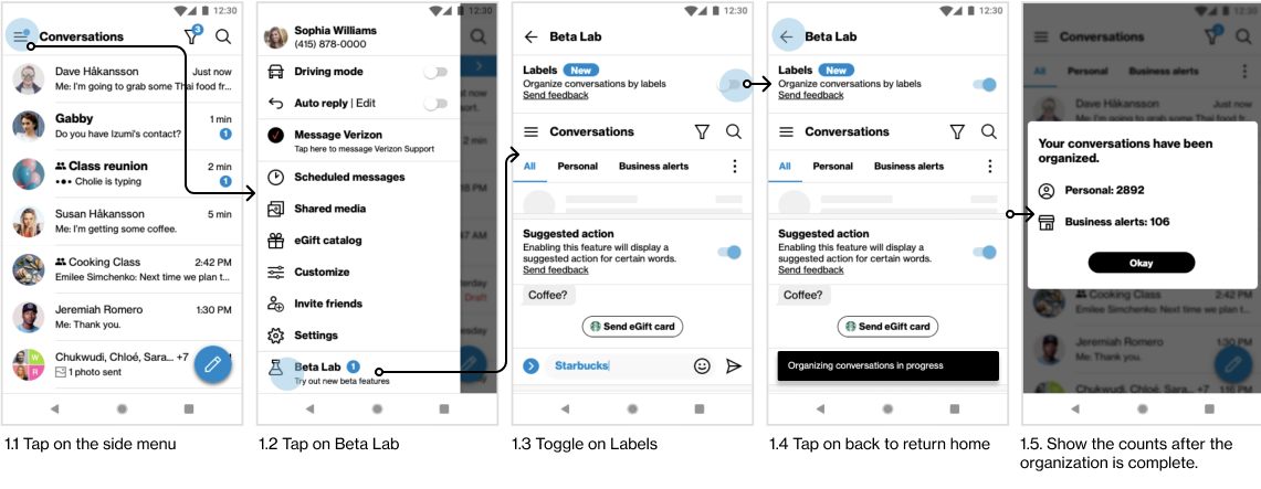
The Outcome
Beta testing attracted 130,913 users, with positive feedback highlighting the need for customizable labels and manual labeling. The feature launched with "Personal" and "Business" categories, with plans for future updates based on user insights. This was the last feature added before transitioning to Verizon Cloud.