
Verizon Cloud allows users to back up and access their files across devices, but retrieving recent uploads wasn’t intuitive. The home section displayed only the last eight uploads, requiring users to dig through folders or navigate to different sections to find their latest content. This lack of quick access disrupted the user experience.
Problem
Users needed a faster, more convenient way to access recently backed-up files. The absence of a dedicated 'Recents' section led to frustration, reduced efficiency, and increased friction in file retrieval. A more intuitive solution was essential to improve usability and user satisfaction.
Objective
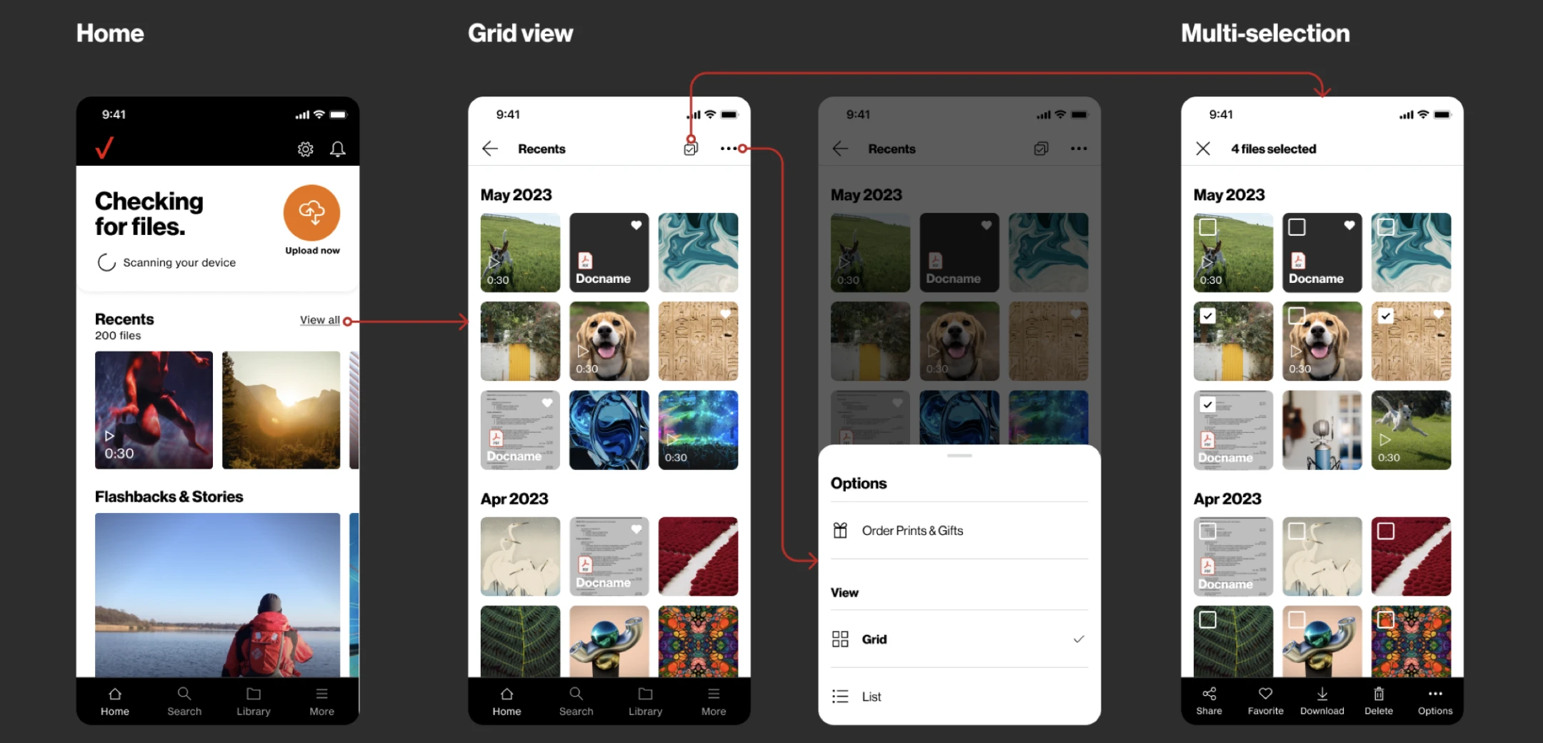
✅ Introducing a Recents page for seamless access to the latest backed
up files.
✅ Standardizing menu options and filters for intuitive navigation.
✅ Implementing Brand 3.0 UI for a modern, cohesive look.

Solution
To enhance usability and streamline file access, I designed a dedicated 'Recents' section, refining the user experience and interactions. This update was also extended to the Favorites and Documents sections for consistency. Before diving into the design, we defined key component updates aligned with brand guidelines. This was a collaborative effort, with contributions from team members across design and development. Through iterative meetings, we refined user flows, finalized file organization, and defined use cases. I also worked closely with developers to establish the scope and MVP for the 24.5 release.
Target Audience
Mobile / Tablet: Members who backed up their mobile device content.
Desktop App / Web: Members who subscribed to a 2TB, Unlimited
Individual, or Unlimited Group plan.
Expect contact only users.
Research
Cross-Platform Audit: Documented current file options across different data classes on both Android and iOS to identify inconsistencies.

Standardizing Sort & Filter: Reviewed and aligned sort and filter options across applicable data classes to improve usability.

Competitive Analysis: Researched competitor apps’ functionality and hand gestures to identify best practices and potential improvements.

Through this research, I collaborated with the Product Manager to finalize which options to keep and remove in multi-selection use cases. This process helped unify missing pieces between the two platforms, ensuring a more consistent user experience.
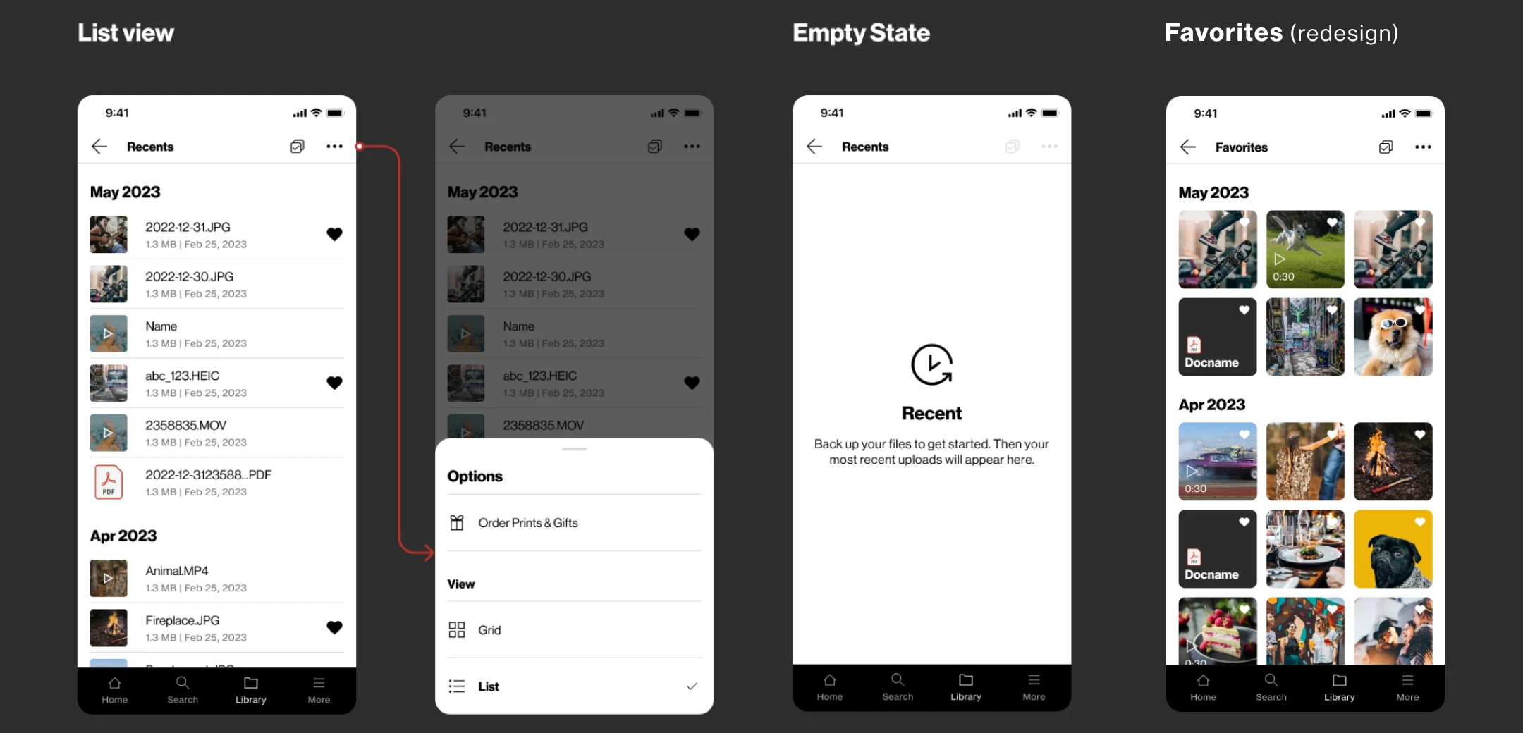
List View Design
To improve accessibility and organization, we introduced a 'List View' option, allowing users to see file names, details, and timestamps in a structured format. This provided a more efficient way to browse, sort, and locate files quickly, especially for document-heavy users. By offering both Grid and List views, we enhanced flexibility, ensuring users could choose the display mode that best suited their workflow.
Prototype
I developed 2 prototypes to test out the different use cases and user interaction for Recents and Favorites. Each prototype can test all the different options and selection use case between single file and multiple file types. The prototype was also presented to the stakeholder and developers to tell the story. Using this prototype allow us to check on all the use case and make sure nothing is missing from the current BAU options.

File selection options
Selection functionality went beyond just photos—it supported various combinations like videos, documents, audio files, or any mix of these types (e.g., videos + photos, photos + documents, etc.), in both single- and multi-select modes. I used prototypes and design specs to guide conversations with developers, helping define interactions, behaviors, and technical requirements throughout the build process.

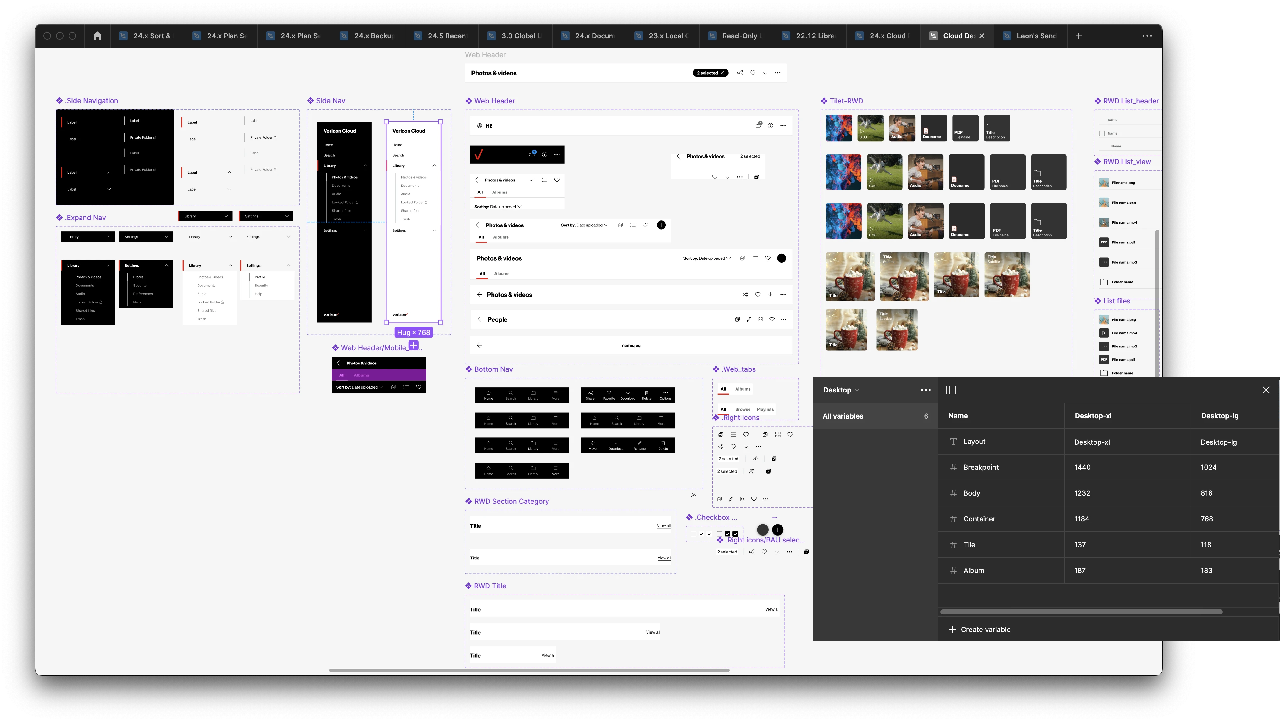
Design library
During the design process, I created a new team library using Figma’s variables to streamline and reduce the number of components. The system I developed is flexible and reusable across platforms—including mobile, tablet, desktop, and web.
The outcome
Recents and Favorites were successfully released in the 24.5 update as part of the app’s overall enhancement and rebrand. Before transitioning off the team, I helped kick off phase two, focused on introducing new sorting and filtering features. Strong collaboration with the Product and CX teams enabled us to move quickly and deliver a more intuitive and unified experience for users.