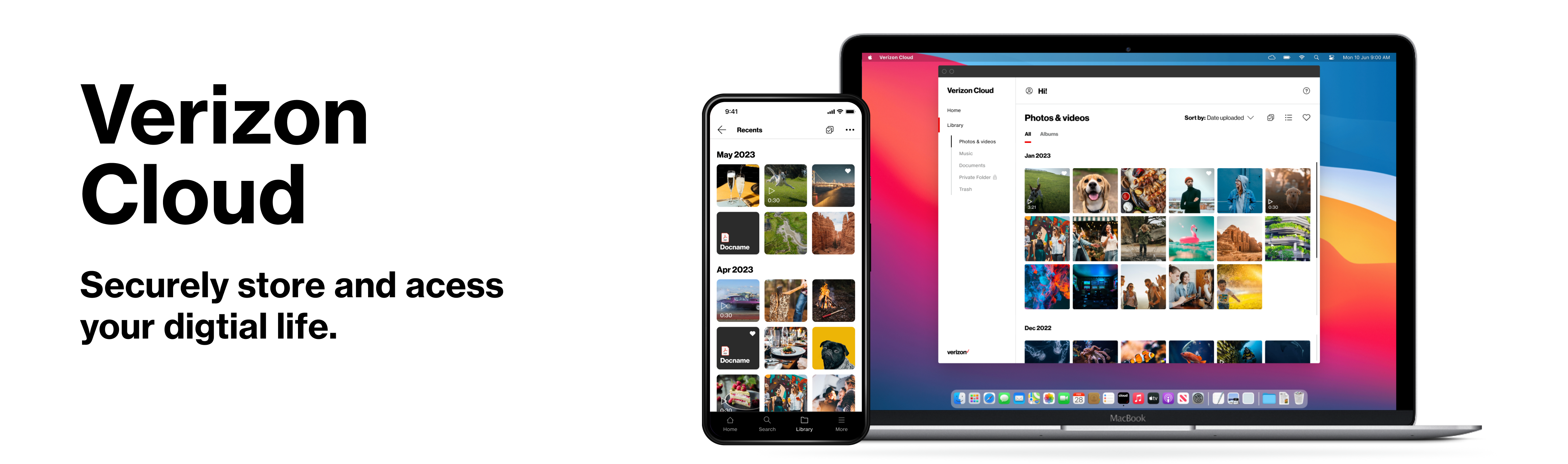
Verizon Cloud is a secure online storage service that allows users to back up and access their photos, videos, contacts (mobile only), audio, and documents from any device. It offers a seamless way to keep digital content safe and readily available across platforms. I led the UX/UI design for the Verizon Cloud toolbar on desktop, driving the experience from concept through feature release and ongoing enhancements. I defined the product vision and collaborated closely with product managers, a design manager, engineers, researchers, content strategists, and QA to bring it to life.
Problems
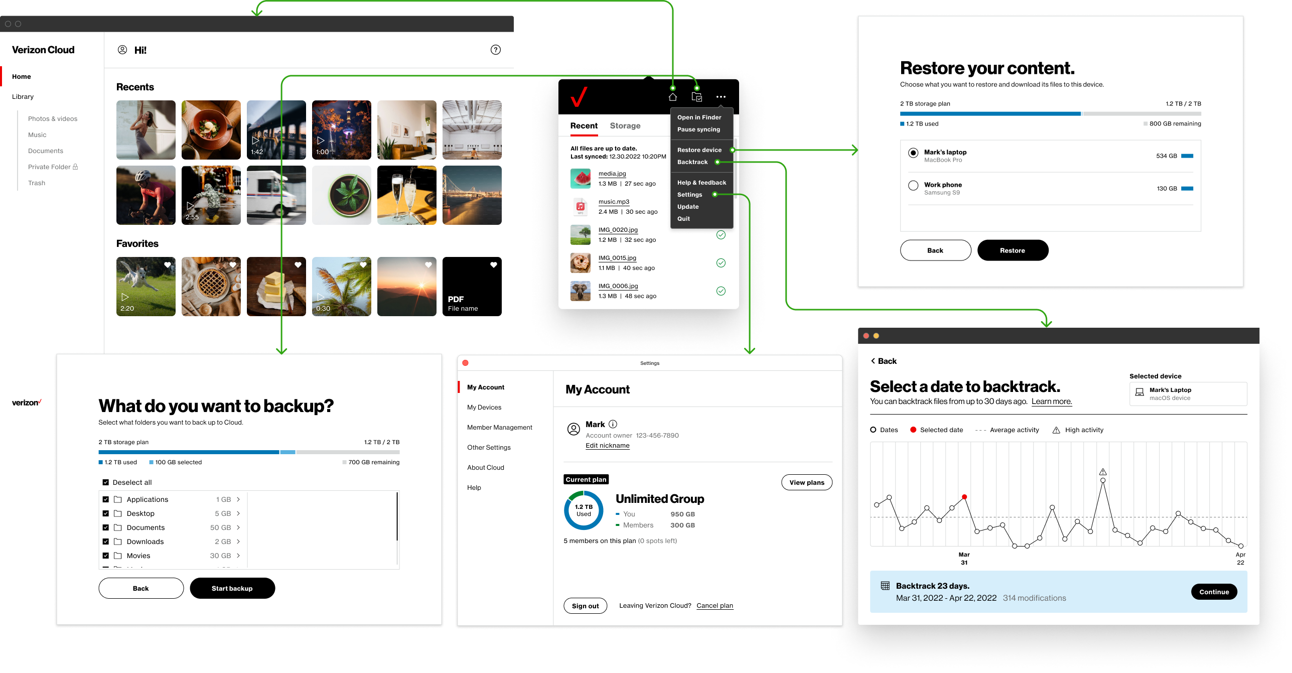
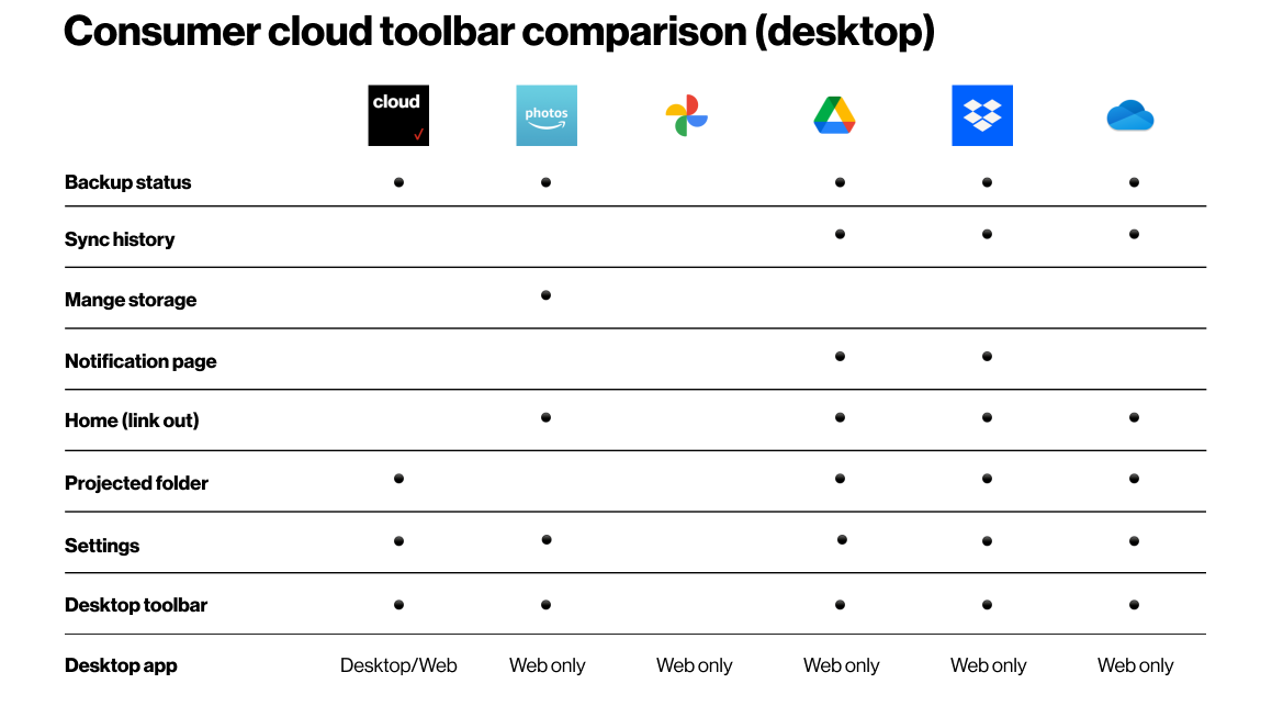
The toolbar lacked essential information, functions, and user engagement features, making it challenging for users to navigate effectively and reducing its overall usability. Key issues included:
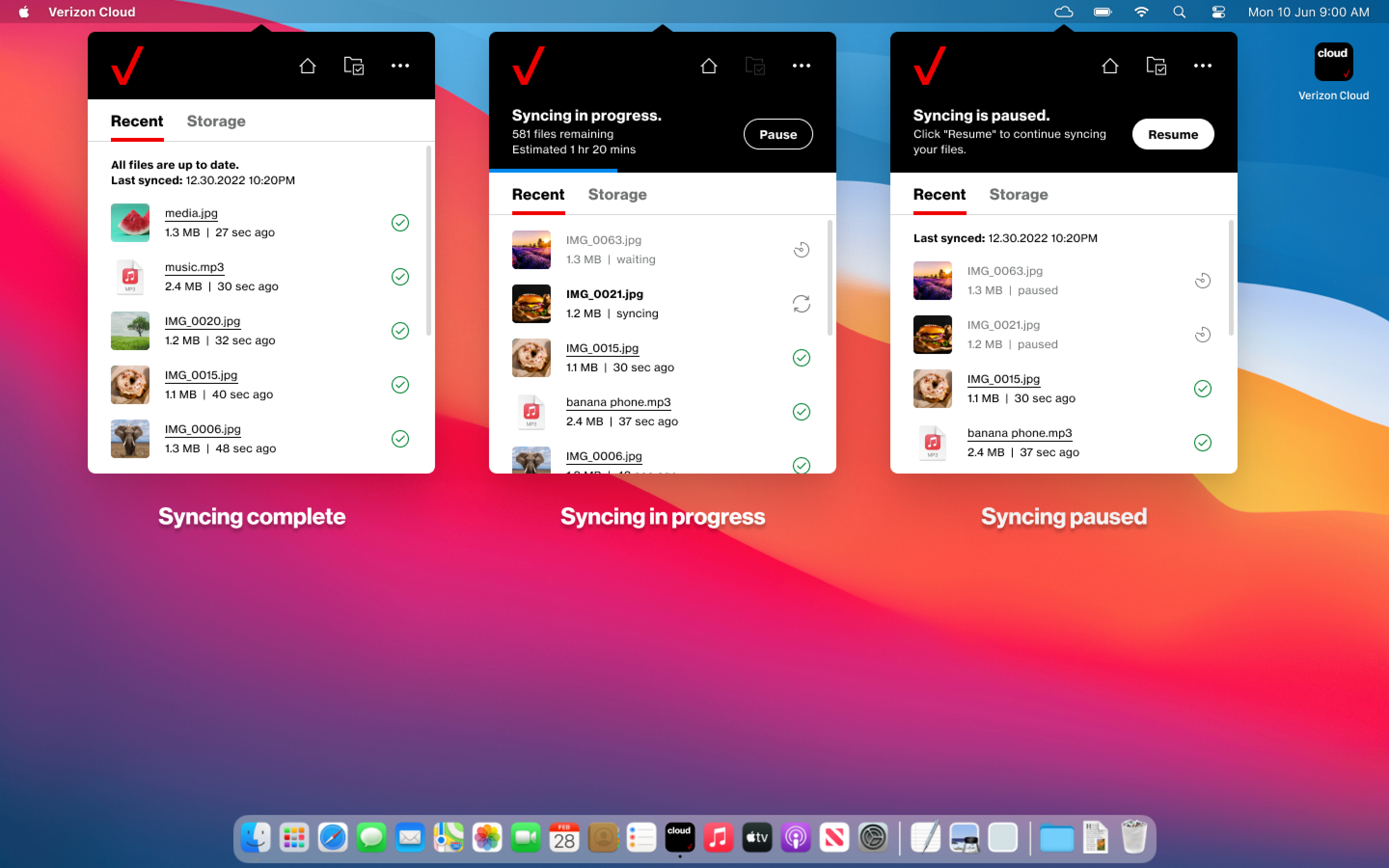
- Lack of recent backup file status.
- Limited storage information.
- No connection to the desktop app.
Objective
Enhance the usability and engagement of the Verizon Cloud platform by redesigning the toolbar. Create a more intuitive and user-friendly interface, address existing limitations, and ensure seamless integration within the Verizon Cloud ecosystem to increase customer satisfaction, retention, and subscription rates.
Solution
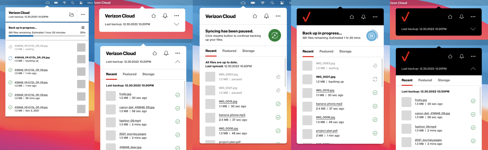
To improve usability and user engagement, I redesigned the Verizon Cloud desktop toolbar with a focus on clarity, functionality, and integration. The new design introduces key features such as recent backup status, detailed storage information, and direct access to the desktop app. By implementing an intuitive layout, guided tooltips, and a notification system, the toolbar now delivers a more cohesive and user-friendly experience that aligns with user needs and Verizon’s product goals.
Target Audience
Individuals:
Users looking to manage and access personal content easily across devices.
Professionals:
Those needing efficient backup and access to their work-related files.
Research
I conducted competitor research on Google Photos, Amazon Photos, Dropbox, OneDrive, and Google Drive, analyzing their features and user experiences. This helped identify key strengths and market gaps. Collaborated with the design manager to define the project’s unique features and scope, ensuring a competitive edge.
Design Process
Before finalizing the design, I explored several concepts and iterations, focusing on a meaningful, user-friendly toolbar. I considered brand guidelines, toolbar size constraints, and ideated designs with collapsible sections, user behavior, color usage, and defined sections.
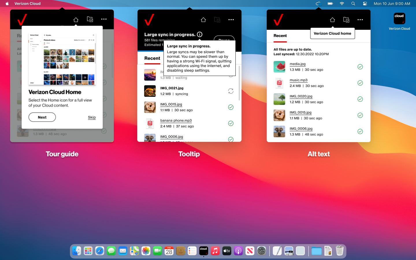
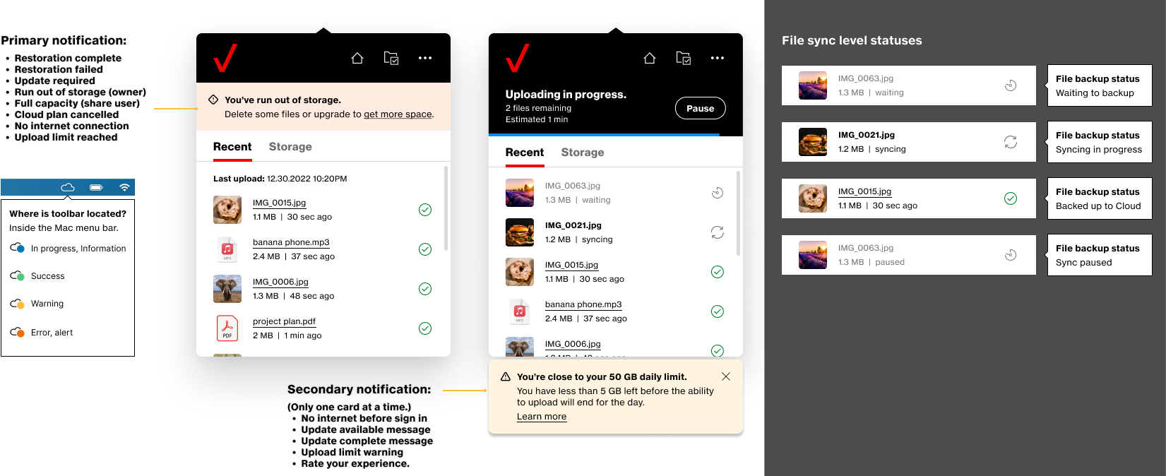
Tour Guide & Notifications
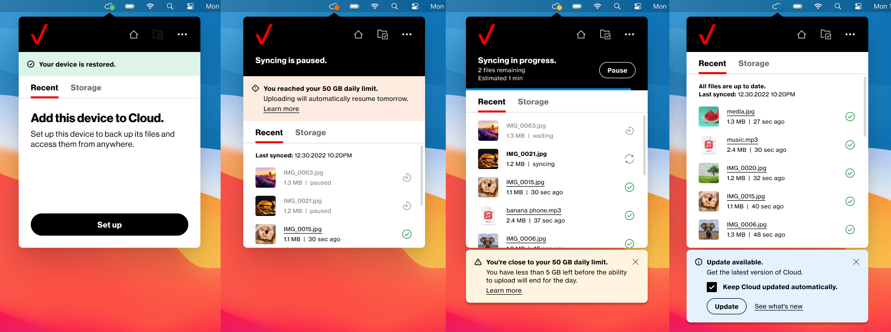
To ensure effortless navigation, I added a tour guide and tooltips to guide users through the new UI, enhancing the first-time experience. For notifications, I documented a matrix of previous notifications, redefined them as primary and secondary, and designed a system to display one at a time, preventing overload.
Design Guideline
To ensure consistency across platforms, we established a unified design system documenting fonts, colors, iconography, and spacing in a comprehensive style guide. Figma bridged the gap between design and development.
The Outcome
The redesigned Verizon Cloud toolbar led to a more intuitive and engaging user experience. Key improvements included real-time backup status, accessible storage information, and seamless desktop app integration. The addition of a guided tour, contextual tooltips, and a streamlined notification system helped users navigate the interface with ease. Through close collaboration across teams and iterative design sprints, we delivered a cohesive solution that aligned with user needs and enhanced the overall platform experience.